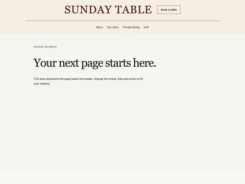
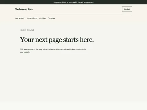
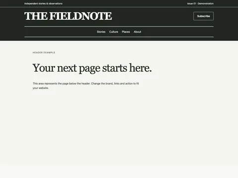
Home / Snippets / Headers / Ledger editorial masthead Try the design Preview widthFit panel Mobile · 390 px Tablet · 768 px Desktop · 1280 px Open demo ↗
Preview links stay in the example. Copy the source to use your own destinations. Form previews never send information.
Copy the source HTML CSS JavaScript Astro
Copy HTML <header class="fct-ledger-editorial-header e-masthead" data-snippet="ledger-editorial-header">
<div class="c-service">
<div class="c-inner">
<span>Independent stories. A wider view.</span><a href="help.html">Help & information</a
><a href="contact.html">Contact</a>
</div>
</div>
<div class="c-header-main c-inner">
<a class="c-brand" href="index.html" aria-label="Ledger home">Ledger</a
><button
class="c-menu-button"
type="button"
aria-expanded="false"
aria-controls="fct-ledger-editorial-header-nav"
>
Menu <span aria-hidden="true">+</span>
</button>
<nav id="fct-ledger-editorial-header-nav" aria-label="Primary">
<details class="c-shop">
<summary>Browse <span aria-hidden="true">⌄</span></summary>
<div class="c-mega">
<div class="c-mega-inner">
<div>
<h2>Browse</h2>
<ul>
<li><a href="news.html">News</a></li>
<li><a href="culture.html">Culture</a></li>
<li><a href="ideas.html">Ideas</a></li>
<li><a href="the-weekend.html">The weekend</a></li>
</ul>
</div>
<div>
<h2>Helpful information</h2>
<ul>
<li><a href="our-approach.html">Our approach</a></li>
<li><a href="useful-resources.html">Useful resources</a></li>
<li><a href="news-notes.html">News & notes</a></li>
<li><a href="contact.html">Contact</a></li>
</ul>
</div>
<div class="e-menu-note">
<p>Ledger</p>
<span>Independent stories. A wider view.</span
><a class="c-link" href="about.html">About us <span aria-hidden="true">↗</span></a>
</div>
</div>
</div>
</details>
<a href="culture.html">Culture</a><a href="ideas.html">Ideas</a
><a href="the-weekend.html">The weekend</a
><a class="c-bag" href="contact.html">Get in touch</a>
</nav>
</div>
</header>
Copy CSS .fct-ledger-editorial-header {
--ink: #252a27;
--muted: #5c655f;
--line: #c7ccc4;
--accent: #294c39;
background: #fff;
color: var(--ink);
font:
16px/1.55 Arial,
Helvetica,
sans-serif;
}
.fct-ledger-editorial-header,
.fct-ledger-editorial-header * {
box-sizing: border-box;
}
.fct-ledger-editorial-header :is(h2, h3, h4, p, ul, figure, dl, dd) {
margin: 0;
}
.fct-ledger-editorial-header :is(h2, h3, h4) {
font-weight: 400;
line-height: 1.1;
letter-spacing: -0.04em;
}
.fct-ledger-editorial-header a {
color: inherit;
text-underline-offset: 4px;
}
.fct-ledger-editorial-header :is(input, select, button) {
font: inherit;
color: inherit;
}
.fct-ledger-editorial-header :is(a, button, input, select, summary):focus-visible {
outline: 3px solid #a33d12;
outline-offset: 4px;
}
.fct-ledger-editorial-header .c-inner {
max-width: 1360px;
margin: auto;
padding: 50px clamp(20px, 4vw, 56px);
}
.fct-ledger-editorial-header .c-kicker {
font-size: 0.8125rem;
letter-spacing: 0.04em;
text-transform: uppercase;
}
.fct-ledger-editorial-header .c-note {
font-size: 0.8125rem;
color: var(--muted);
}
.fct-ledger-editorial-header img {
display: block;
width: 100%;
height: auto;
}
.fct-ledger-editorial-header [hidden] {
display: none !important;
}
.fct-ledger-editorial-header .c-link {
display: flex;
align-items: center;
justify-content: space-between;
gap: 15px;
min-height: 44px;
text-decoration: none;
border-bottom: 1px solid currentColor;
padding-block: 10px;
}
.fct-ledger-editorial-header button {
min-height: 44px;
cursor: pointer;
}
.fct-ledger-editorial-header summary {
min-height: 44px;
align-content: center;
cursor: pointer;
}
.fct-ledger-editorial-header .c-visually-hidden {
position: absolute;
width: 1px;
height: 1px;
overflow: hidden;
clip-path: inset(50%);
white-space: nowrap;
}
@media (max-width: 700px) {
.fct-ledger-editorial-header .c-inner {
padding-block: 32px;
}
}
.fct-ledger-editorial-header {
background: #f2f0e8;
position: relative;
z-index: 1;
}
.fct-ledger-editorial-header .c-service {
border-bottom: 1px solid #d8dbd1;
}
.fct-ledger-editorial-header .c-service .c-inner {
display: flex;
justify-content: end;
gap: 28px;
align-items: center;
padding-block: 5px;
font-size: 0.75rem;
}
.fct-ledger-editorial-header .c-service span {
margin-right: auto;
}
.fct-ledger-editorial-header .c-service a {
display: flex;
align-items: center;
min-height: 32px;
text-decoration: none;
}
.fct-ledger-editorial-header .c-header-main {
display: flex;
gap: 60px;
align-items: center;
padding-block: 23px;
position: relative;
}
.fct-ledger-editorial-header .c-brand {
font:
400 3.5rem/0.9 Georgia,
serif;
letter-spacing: -0.065em;
text-decoration: none;
flex: none;
min-height: 54px;
align-content: center;
}
.fct-ledger-editorial-header .c-brand > span {
color: #94613d;
}
.fct-ledger-editorial-header nav {
display: flex;
align-items: center;
gap: 30px;
flex: 1;
}
.fct-ledger-editorial-header nav > a {
display: flex;
align-items: center;
min-height: 48px;
text-decoration: none;
font-size: 0.9375rem;
}
.fct-ledger-editorial-header .c-bag {
margin-left: auto;
gap: 6px;
}
.fct-ledger-editorial-header .c-bag span {
font-size: 0.75rem;
}
.fct-ledger-editorial-header .c-shop > summary {
display: flex;
gap: 14px;
align-items: center;
list-style: none;
font-size: 0.9375rem;
min-height: 48px;
}
.fct-ledger-editorial-header .c-shop > summary::-webkit-details-marker {
display: none;
}
.fct-ledger-editorial-header .c-shop[open] > summary {
border-bottom: 1px solid #252a27;
}
.fct-ledger-editorial-header .c-mega {
position: absolute;
inset-inline: 0;
top: 100%;
border-top: 1px solid #c8cec0;
border-bottom: 1px solid #adb7a4;
background: #f2f0e8;
box-shadow: 0 15px 25px #25311e15;
}
.fct-ledger-editorial-header .c-mega-inner {
display: grid;
grid-template-columns: 0.8fr 0.8fr 1.3fr;
gap: 40px;
padding: 35px clamp(20px, 4vw, 56px) 40px;
}
.fct-ledger-editorial-header h2 {
font-size: 0.8125rem;
font-weight: 700;
letter-spacing: 0;
margin-bottom: 16px;
}
.fct-ledger-editorial-header ul {
list-style: none;
padding: 0;
display: grid;
gap: 2px;
}
.fct-ledger-editorial-header li a {
display: flex;
align-items: center;
min-height: 42px;
text-decoration: none;
font-size: 0.9375rem;
}
.fct-ledger-editorial-header li a:hover {
text-decoration: underline;
}
.fct-ledger-editorial-header .c-menu-story {
text-decoration: none;
min-width: 0;
}
.fct-ledger-editorial-header .c-menu-story img {
aspect-ratio: 1.8/1;
object-fit: cover;
max-height: 225px;
}
.fct-ledger-editorial-header .c-menu-story > span {
display: flex;
justify-content: space-between;
gap: 20px;
margin-top: 12px;
font-size: 0.9375rem;
}
.fct-ledger-editorial-header .c-menu-story small {
display: block;
font-size: 0.75rem;
color: var(--muted);
margin-top: 4px;
}
.fct-ledger-editorial-header .c-menu-button {
display: none;
background: transparent;
border: 0;
padding: 8px 0;
min-width: 80px;
justify-content: space-between;
align-items: center;
gap: 20px;
}
@media (max-width: 900px) {
.fct-ledger-editorial-header .c-header-main {
gap: 30px;
}
.fct-ledger-editorial-header nav {
gap: 20px;
}
}
@media (max-width: 700px) {
.fct-ledger-editorial-header .c-service .c-inner {
gap: 15px;
font-size: 0.6875rem;
}
.fct-ledger-editorial-header .c-service a:first-of-type {
display: none;
}
.fct-ledger-editorial-header .c-header-main {
display: flex;
flex-wrap: wrap;
justify-content: space-between;
padding-block: 20px;
gap: 20px;
}
.fct-ledger-editorial-header .c-brand {
font-size: 3rem;
min-height: 48px;
}
.fct-ledger-editorial-header nav {
flex: 0 0 100%;
display: flex;
flex-direction: column;
align-items: stretch;
gap: 0;
}
.fct-ledger-editorial-header nav > a,
.fct-ledger-editorial-header .c-shop > summary {
border-top: 1px solid #c9cfc0;
min-height: 48px;
justify-content: space-between;
}
.fct-ledger-editorial-header .c-bag {
margin: 0;
}
.fct-ledger-editorial-header .c-mega {
position: static;
border: 0;
box-shadow: none;
}
.fct-ledger-editorial-header .c-mega-inner {
grid-template-columns: 1fr 1fr;
gap: 25px;
padding: 25px 0;
}
.fct-ledger-editorial-header .c-menu-story {
grid-column: 1/-1;
}
.fct-ledger-editorial-header .c-menu-story img {
max-height: 210px;
}
.fct-ledger-editorial-header.is-ready .c-menu-button {
display: flex;
}
.fct-ledger-editorial-header.is-ready nav {
display: none;
}
.fct-ledger-editorial-header.is-open nav {
display: flex;
}
.fct-ledger-editorial-header .c-shop[open] > summary {
border-bottom: 0;
}
}
.fct-ledger-editorial-header {
--paper: #f4f7fa;
--accent: #1f4368;
}
.fct-ledger-editorial-header .c-brand {
font-size: 2.6rem;
max-width: 400px;
line-height: 1;
white-space: normal;
}
.fct-ledger-editorial-header .c-mega {
background: var(--paper);
color: #242b29;
}
.fct-ledger-editorial-header .e-menu-note {
padding: 22px;
border: 1px solid #a8b3a4;
align-self: start;
}
.fct-ledger-editorial-header .e-menu-note > p {
font:
400 1.8rem/1.1 Georgia,
serif;
letter-spacing: -0.04em;
margin-bottom: 18px;
}
.fct-ledger-editorial-header .e-menu-note > span {
display: block;
max-width: 24ch;
font-size: 0.9375rem;
line-height: 1.5;
margin-bottom: 20px;
}
.fct-ledger-editorial-header .c-link {
display: flex;
min-height: 44px;
justify-content: space-between;
gap: 20px;
align-items: center;
text-decoration: none;
border-bottom: 1px solid currentColor;
font-size: 0.875rem;
}
.fct-ledger-editorial-header .c-service .c-inner {
font-size: 0.8125rem;
}
.fct-ledger-editorial-header .c-service span {
max-width: 65ch;
}
.fct-ledger-editorial-header .e-header-search {
min-width: 0;
flex: 1;
}
.fct-ledger-editorial-header .e-header-search label {
font-size: 0.8125rem;
display: block;
margin-bottom: 6px;
}
.fct-ledger-editorial-header .e-header-search > div {
display: flex;
gap: 0;
}
.fct-ledger-editorial-header .e-header-search input {
width: 100%;
min-width: 0;
border: 1px solid #9caaa2;
border-right: 0;
background: white;
padding: 12px 15px;
min-height: 48px;
font:
16px Arial,
sans-serif;
color: #242b29;
}
.fct-ledger-editorial-header .e-header-search button {
border: 1px solid var(--accent);
background: var(--accent);
color: #fff;
padding: 10px 18px;
font:
700 14px Arial,
sans-serif;
min-height: 48px;
}
.fct-ledger-editorial-header .c-header-main {
flex-wrap: wrap;
justify-content: center;
padding-block: 22px 10px;
}
.fct-ledger-editorial-header .c-brand {
font:
400 clamp(3rem, 7vw, 6rem)/0.95 Georgia,
serif;
max-width: none;
flex-basis: 100%;
text-align: center;
letter-spacing: -0.065em;
}
.fct-ledger-editorial-header nav {
flex-basis: 100%;
justify-content: center;
border-top: 1px solid #b5beb1;
padding-top: 8px;
margin-top: 18px;
}
.fct-ledger-editorial-header .c-bag {
margin-left: 0;
}
.fct-ledger-editorial-header .c-service {
border-top: 4px solid var(--accent);
}
@media (max-width: 950px) {
.fct-ledger-editorial-header .c-header-main {
display: flex;
flex-wrap: wrap;
justify-content: space-between;
gap: 20px;
align-items: center;
}
.fct-ledger-editorial-header .c-brand {
font-size: 2rem !important;
flex-basis: auto;
text-align: left;
max-width: 65%;
min-height: 44px;
}
.fct-ledger-editorial-header .c-menu-button {
flex: none;
color: inherit;
}
.fct-ledger-editorial-header nav {
flex: 0 0 100%;
padding: 0;
margin: 0;
gap: 0;
justify-content: start;
border: 0;
background: transparent;
color: inherit;
}
.fct-ledger-editorial-header .c-service .c-inner {
font-size: 0.6875rem;
}
.fct-ledger-editorial-header .c-service span {
max-width: 45ch;
}
.fct-ledger-editorial-header .c-service a:first-of-type {
display: none;
}
.fct-ledger-editorial-header .c-mega {
color: #242b29;
}
.fct-ledger-editorial-header .c-bag {
margin: 0;
background: transparent;
color: inherit;
padding: 10px 0;
border-radius: 0;
}
.fct-ledger-editorial-header .e-header-search {
order: 4;
flex-basis: 100%;
}
.fct-ledger-editorial-header .c-brand:before {
display: none;
}
.fct-ledger-editorial-header .c-mega-inner {
padding: 24px 0;
}
.fct-ledger-editorial-header .e-menu-note {
grid-column: 1/-1;
}
}
Copy JavaScript (() => {
for (const root of document.querySelectorAll('[data-snippet="ledger-editorial-header"]')) {
if (root.dataset.initialized) continue;
root.dataset.initialized = "true";
const toggle = root.querySelector(".c-menu-button"),
shop = root.querySelector(".c-shop");
root.classList.add("is-ready");
const close = () => {
root.classList.remove("is-open");
toggle.setAttribute("aria-expanded", "false");
shop.open = false;
};
toggle.addEventListener("click", () => {
const open = toggle.getAttribute("aria-expanded") !== "true";
root.classList.toggle("is-open", open);
toggle.setAttribute("aria-expanded", String(open));
if (!open) shop.open = false;
});
root.addEventListener("keydown", (e) => {
if (e.key === "Escape") {
if (shop.open) {
shop.open = false;
shop.querySelector("summary").focus();
} else if (root.classList.contains("is-open")) {
close();
toggle.focus();
}
}
});
document.addEventListener("click", (e) => {
if (!root.contains(e.target)) shop.open = false;
});
const mq = matchMedia("(max-width:950px)");
mq.addEventListener("change", close);
}
})();
Copy Astro ---
// Original reusable section. Use unique IDs, selectors and radio names before duplicating.
---
<header class="fct-ledger-editorial-header e-masthead" data-snippet="ledger-editorial-header">
  <div class="c-service">
    <div class="c-inner">
      <span>Independent stories. A wider view.</span><a href="help.html">Help & information</a
      ><a href="contact.html">Contact</a>
    </div>
  </div>
  <div class="c-header-main c-inner">
    <a class="c-brand" href="index.html" aria-label="Ledger home">Ledger</a
    ><button
      class="c-menu-button"
      type="button"
      aria-expanded="false"
      aria-controls="fct-ledger-editorial-header-nav"
    >
      Menu <span aria-hidden="true">+</span>
    </button>
    <nav id="fct-ledger-editorial-header-nav" aria-label="Primary">
      <details class="c-shop">
        <summary>Browse <span aria-hidden="true">⌄</span></summary>
        <div class="c-mega">
          <div class="c-mega-inner">
            <div>
              <h2>Browse</h2>
              <ul>
                <li><a href="news.html">News</a></li>
                <li><a href="culture.html">Culture</a></li>
                <li><a href="ideas.html">Ideas</a></li>
                <li><a href="the-weekend.html">The weekend</a></li>
              </ul>
            </div>
            <div>
              <h2>Helpful information</h2>
              <ul>
                <li><a href="our-approach.html">Our approach</a></li>
                <li><a href="useful-resources.html">Useful resources</a></li>
                <li><a href="news-notes.html">News & notes</a></li>
                <li><a href="contact.html">Contact</a></li>
              </ul>
            </div>
            <div class="e-menu-note">
              <p>Ledger</p>
              <span>Independent stories. A wider view.</span
              ><a class="c-link" href="about.html">About us <span aria-hidden="true">↗</span></a>
            </div>
          </div>
        </div>
      </details>
      <a href="culture.html">Culture</a><a href="ideas.html">Ideas</a
      ><a href="the-weekend.html">The weekend</a
      ><a class="c-bag" href="contact.html">Get in touch</a>
    </nav>
  </div>
</header>
<style is:global>
.fct-ledger-editorial-header {
  --ink: #252a27;
  --muted: #5c655f;
  --line: #c7ccc4;
  --accent: #294c39;
  background: #fff;
  color: var(--ink);
  font:
    16px/1.55 Arial,
    Helvetica,
    sans-serif;
}
.fct-ledger-editorial-header,
.fct-ledger-editorial-header * {
  box-sizing: border-box;
}
.fct-ledger-editorial-header :is(h2, h3, h4, p, ul, figure, dl, dd) {
  margin: 0;
}
.fct-ledger-editorial-header :is(h2, h3, h4) {
  font-weight: 400;
  line-height: 1.1;
  letter-spacing: -0.04em;
}
.fct-ledger-editorial-header a {
  color: inherit;
  text-underline-offset: 4px;
}
.fct-ledger-editorial-header :is(input, select, button) {
  font: inherit;
  color: inherit;
}
.fct-ledger-editorial-header :is(a, button, input, select, summary):focus-visible {
  outline: 3px solid #a33d12;
  outline-offset: 4px;
}
.fct-ledger-editorial-header .c-inner {
  max-width: 1360px;
  margin: auto;
  padding: 50px clamp(20px, 4vw, 56px);
}
.fct-ledger-editorial-header .c-kicker {
  font-size: 0.8125rem;
  letter-spacing: 0.04em;
  text-transform: uppercase;
}
.fct-ledger-editorial-header .c-note {
  font-size: 0.8125rem;
  color: var(--muted);
}
.fct-ledger-editorial-header img {
  display: block;
  width: 100%;
  height: auto;
}
.fct-ledger-editorial-header [hidden] {
  display: none !important;
}
.fct-ledger-editorial-header .c-link {
  display: flex;
  align-items: center;
  justify-content: space-between;
  gap: 15px;
  min-height: 44px;
  text-decoration: none;
  border-bottom: 1px solid currentColor;
  padding-block: 10px;
}
.fct-ledger-editorial-header button {
  min-height: 44px;
  cursor: pointer;
}
.fct-ledger-editorial-header summary {
  min-height: 44px;
  align-content: center;
  cursor: pointer;
}
.fct-ledger-editorial-header .c-visually-hidden {
  position: absolute;
  width: 1px;
  height: 1px;
  overflow: hidden;
  clip-path: inset(50%);
  white-space: nowrap;
}
@media (max-width: 700px) {
  .fct-ledger-editorial-header .c-inner {
    padding-block: 32px;
  }
}
.fct-ledger-editorial-header {
  background: #f2f0e8;
  position: relative;
  z-index: 1;
}
.fct-ledger-editorial-header .c-service {
  border-bottom: 1px solid #d8dbd1;
}
.fct-ledger-editorial-header .c-service .c-inner {
  display: flex;
  justify-content: end;
  gap: 28px;
  align-items: center;
  padding-block: 5px;
  font-size: 0.75rem;
}
.fct-ledger-editorial-header .c-service span {
  margin-right: auto;
}
.fct-ledger-editorial-header .c-service a {
  display: flex;
  align-items: center;
  min-height: 32px;
  text-decoration: none;
}
.fct-ledger-editorial-header .c-header-main {
  display: flex;
  gap: 60px;
  align-items: center;
  padding-block: 23px;
  position: relative;
}
.fct-ledger-editorial-header .c-brand {
  font:
    400 3.5rem/0.9 Georgia,
    serif;
  letter-spacing: -0.065em;
  text-decoration: none;
  flex: none;
  min-height: 54px;
  align-content: center;
}
.fct-ledger-editorial-header .c-brand > span {
  color: #94613d;
}
.fct-ledger-editorial-header nav {
  display: flex;
  align-items: center;
  gap: 30px;
  flex: 1;
}
.fct-ledger-editorial-header nav > a {
  display: flex;
  align-items: center;
  min-height: 48px;
  text-decoration: none;
  font-size: 0.9375rem;
}
.fct-ledger-editorial-header .c-bag {
  margin-left: auto;
  gap: 6px;
}
.fct-ledger-editorial-header .c-bag span {
  font-size: 0.75rem;
}
.fct-ledger-editorial-header .c-shop > summary {
  display: flex;
  gap: 14px;
  align-items: center;
  list-style: none;
  font-size: 0.9375rem;
  min-height: 48px;
}
.fct-ledger-editorial-header .c-shop > summary::-webkit-details-marker {
  display: none;
}
.fct-ledger-editorial-header .c-shop[open] > summary {
  border-bottom: 1px solid #252a27;
}
.fct-ledger-editorial-header .c-mega {
  position: absolute;
  inset-inline: 0;
  top: 100%;
  border-top: 1px solid #c8cec0;
  border-bottom: 1px solid #adb7a4;
  background: #f2f0e8;
  box-shadow: 0 15px 25px #25311e15;
}
.fct-ledger-editorial-header .c-mega-inner {
  display: grid;
  grid-template-columns: 0.8fr 0.8fr 1.3fr;
  gap: 40px;
  padding: 35px clamp(20px, 4vw, 56px) 40px;
}
.fct-ledger-editorial-header h2 {
  font-size: 0.8125rem;
  font-weight: 700;
  letter-spacing: 0;
  margin-bottom: 16px;
}
.fct-ledger-editorial-header ul {
  list-style: none;
  padding: 0;
  display: grid;
  gap: 2px;
}
.fct-ledger-editorial-header li a {
  display: flex;
  align-items: center;
  min-height: 42px;
  text-decoration: none;
  font-size: 0.9375rem;
}
.fct-ledger-editorial-header li a:hover {
  text-decoration: underline;
}
.fct-ledger-editorial-header .c-menu-story {
  text-decoration: none;
  min-width: 0;
}
.fct-ledger-editorial-header .c-menu-story img {
  aspect-ratio: 1.8/1;
  object-fit: cover;
  max-height: 225px;
}
.fct-ledger-editorial-header .c-menu-story > span {
  display: flex;
  justify-content: space-between;
  gap: 20px;
  margin-top: 12px;
  font-size: 0.9375rem;
}
.fct-ledger-editorial-header .c-menu-story small {
  display: block;
  font-size: 0.75rem;
  color: var(--muted);
  margin-top: 4px;
}
.fct-ledger-editorial-header .c-menu-button {
  display: none;
  background: transparent;
  border: 0;
  padding: 8px 0;
  min-width: 80px;
  justify-content: space-between;
  align-items: center;
  gap: 20px;
}
@media (max-width: 900px) {
  .fct-ledger-editorial-header .c-header-main {
    gap: 30px;
  }
  .fct-ledger-editorial-header nav {
    gap: 20px;
  }
}
@media (max-width: 700px) {
  .fct-ledger-editorial-header .c-service .c-inner {
    gap: 15px;
    font-size: 0.6875rem;
  }
  .fct-ledger-editorial-header .c-service a:first-of-type {
    display: none;
  }
  .fct-ledger-editorial-header .c-header-main {
    display: flex;
    flex-wrap: wrap;
    justify-content: space-between;
    padding-block: 20px;
    gap: 20px;
  }
  .fct-ledger-editorial-header .c-brand {
    font-size: 3rem;
    min-height: 48px;
  }
  .fct-ledger-editorial-header nav {
    flex: 0 0 100%;
    display: flex;
    flex-direction: column;
    align-items: stretch;
    gap: 0;
  }
  .fct-ledger-editorial-header nav > a,
  .fct-ledger-editorial-header .c-shop > summary {
    border-top: 1px solid #c9cfc0;
    min-height: 48px;
    justify-content: space-between;
  }
  .fct-ledger-editorial-header .c-bag {
    margin: 0;
  }
  .fct-ledger-editorial-header .c-mega {
    position: static;
    border: 0;
    box-shadow: none;
  }
  .fct-ledger-editorial-header .c-mega-inner {
    grid-template-columns: 1fr 1fr;
    gap: 25px;
    padding: 25px 0;
  }
  .fct-ledger-editorial-header .c-menu-story {
    grid-column: 1/-1;
  }
  .fct-ledger-editorial-header .c-menu-story img {
    max-height: 210px;
  }
  .fct-ledger-editorial-header.is-ready .c-menu-button {
    display: flex;
  }
  .fct-ledger-editorial-header.is-ready nav {
    display: none;
  }
  .fct-ledger-editorial-header.is-open nav {
    display: flex;
  }
  .fct-ledger-editorial-header .c-shop[open] > summary {
    border-bottom: 0;
  }
}
.fct-ledger-editorial-header {
  --paper: #f4f7fa;
  --accent: #1f4368;
}
.fct-ledger-editorial-header .c-brand {
  font-size: 2.6rem;
  max-width: 400px;
  line-height: 1;
  white-space: normal;
}
.fct-ledger-editorial-header .c-mega {
  background: var(--paper);
  color: #242b29;
}
.fct-ledger-editorial-header .e-menu-note {
  padding: 22px;
  border: 1px solid #a8b3a4;
  align-self: start;
}
.fct-ledger-editorial-header .e-menu-note > p {
  font:
    400 1.8rem/1.1 Georgia,
    serif;
  letter-spacing: -0.04em;
  margin-bottom: 18px;
}
.fct-ledger-editorial-header .e-menu-note > span {
  display: block;
  max-width: 24ch;
  font-size: 0.9375rem;
  line-height: 1.5;
  margin-bottom: 20px;
}
.fct-ledger-editorial-header .c-link {
  display: flex;
  min-height: 44px;
  justify-content: space-between;
  gap: 20px;
  align-items: center;
  text-decoration: none;
  border-bottom: 1px solid currentColor;
  font-size: 0.875rem;
}
.fct-ledger-editorial-header .c-service .c-inner {
  font-size: 0.8125rem;
}
.fct-ledger-editorial-header .c-service span {
  max-width: 65ch;
}
.fct-ledger-editorial-header .e-header-search {
  min-width: 0;
  flex: 1;
}
.fct-ledger-editorial-header .e-header-search label {
  font-size: 0.8125rem;
  display: block;
  margin-bottom: 6px;
}
.fct-ledger-editorial-header .e-header-search > div {
  display: flex;
  gap: 0;
}
.fct-ledger-editorial-header .e-header-search input {
  width: 100%;
  min-width: 0;
  border: 1px solid #9caaa2;
  border-right: 0;
  background: white;
  padding: 12px 15px;
  min-height: 48px;
  font:
    16px Arial,
    sans-serif;
  color: #242b29;
}
.fct-ledger-editorial-header .e-header-search button {
  border: 1px solid var(--accent);
  background: var(--accent);
  color: #fff;
  padding: 10px 18px;
  font:
    700 14px Arial,
    sans-serif;
  min-height: 48px;
}
.fct-ledger-editorial-header .c-header-main {
  flex-wrap: wrap;
  justify-content: center;
  padding-block: 22px 10px;
}
.fct-ledger-editorial-header .c-brand {
  font:
    400 clamp(3rem, 7vw, 6rem)/0.95 Georgia,
    serif;
  max-width: none;
  flex-basis: 100%;
  text-align: center;
  letter-spacing: -0.065em;
}
.fct-ledger-editorial-header nav {
  flex-basis: 100%;
  justify-content: center;
  border-top: 1px solid #b5beb1;
  padding-top: 8px;
  margin-top: 18px;
}
.fct-ledger-editorial-header .c-bag {
  margin-left: 0;
}
.fct-ledger-editorial-header .c-service {
  border-top: 4px solid var(--accent);
}
@media (max-width: 950px) {
  .fct-ledger-editorial-header .c-header-main {
    display: flex;
    flex-wrap: wrap;
    justify-content: space-between;
    gap: 20px;
    align-items: center;
  }
  .fct-ledger-editorial-header .c-brand {
    font-size: 2rem !important;
    flex-basis: auto;
    text-align: left;
    max-width: 65%;
    min-height: 44px;
  }
  .fct-ledger-editorial-header .c-menu-button {
    flex: none;
    color: inherit;
  }
  .fct-ledger-editorial-header nav {
    flex: 0 0 100%;
    padding: 0;
    margin: 0;
    gap: 0;
    justify-content: start;
    border: 0;
    background: transparent;
    color: inherit;
  }
  .fct-ledger-editorial-header .c-service .c-inner {
    font-size: 0.6875rem;
  }
  .fct-ledger-editorial-header .c-service span {
    max-width: 45ch;
  }
  .fct-ledger-editorial-header .c-service a:first-of-type {
    display: none;
  }
  .fct-ledger-editorial-header .c-mega {
    color: #242b29;
  }
  .fct-ledger-editorial-header .c-bag {
    margin: 0;
    background: transparent;
    color: inherit;
    padding: 10px 0;
    border-radius: 0;
  }
  .fct-ledger-editorial-header .e-header-search {
    order: 4;
    flex-basis: 100%;
  }
  .fct-ledger-editorial-header .c-brand:before {
    display: none;
  }
  .fct-ledger-editorial-header .c-mega-inner {
    padding: 24px 0;
  }
  .fct-ledger-editorial-header .e-menu-note {
    grid-column: 1/-1;
  }
}
</style>
<script is:inline>
(() => {
  for (const root of document.querySelectorAll('[data-snippet="ledger-editorial-header"]')) {
    if (root.dataset.initialized) continue;
    root.dataset.initialized = "true";
    const toggle = root.querySelector(".c-menu-button"),
      shop = root.querySelector(".c-shop");
    root.classList.add("is-ready");
    const close = () => {
      root.classList.remove("is-open");
      toggle.setAttribute("aria-expanded", "false");
      shop.open = false;
    };
    toggle.addEventListener("click", () => {
      const open = toggle.getAttribute("aria-expanded") !== "true";
      root.classList.toggle("is-open", open);
      toggle.setAttribute("aria-expanded", String(open));
      if (!open) shop.open = false;
    });
    root.addEventListener("keydown", (e) => {
      if (e.key === "Escape") {
        if (shop.open) {
          shop.open = false;
          shop.querySelector("summary").focus();
        } else if (root.classList.contains("is-open")) {
          close();
          toggle.focus();
        }
      }
    });
    document.addEventListener("click", (e) => {
      if (!root.contains(e.target)) shop.open = false;
    });
    const mq = matchMedia("(max-width:950px)");
    mq.addEventListener("change", close);
  }
})();
</script>
Code tabs need JavaScript. All source formats are included in the open downloads.
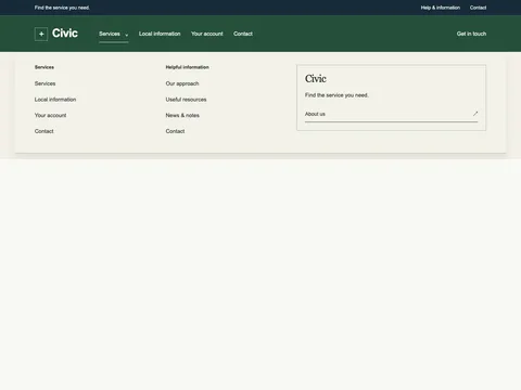
Where this design fits The masthead composition separates primary browsing from utility links. The expandable group uses native details; the mobile button adds Escape and focus-return behavior. Adapt the sample destinations to your own content hierarchy.
Primary and utility navigation Native grouped-link disclosure Mobile keyboard and no-JavaScript support The real-site reference Monocle subscriptions ↗
The reference informs editorial hierarchy, publication identity and subscription choices. This example uses original branding, copy, styling and code; it does not reproduce the reference product or its assets. Reference inspected 2 November 2026. This example has its own branding, content and code; it is not affiliated with the reference product.
What is included The HTML ZIP includes a standalone demo, reusable markup, scoped CSS, its small JavaScript runtime, a license and setup notes. The Astro ZIP includes Snippet.astro. It can be imported into an existing Astro page or layout.
Set the right destinations Example navigation, policy and contact links must point to your actual pages. Update visible business details and telephone/email links together. Remove sections that your website does not need.
Add it to an HTML website Copy snippet.html into the relevant page section. Load snippet.css after your existing site stylesheet. The class prefix identifies this design. Load snippet.js once with defer. Keep the included keyboard behavior when adapting interactions. Replace example content and check mobile widths, zoom, links and keyboard focus in your actual website. Use it in Astro Copy Snippet.astro into src/components/, import it into your page or shared layout, and insert the component where the section belongs. Keep each generated prefix unique if you duplicate a component on one page.
Keep the section maintainable Start with the variables at the top of the CSS for background, text and accent colors. Preserve semantic labels and focus styles. Existing site selectors can still affect imported markup, so test the combined result. Read the complete setup notes .